KPI Design: 15 Essential Indicators for Your Management Dashboard
What is a KPI and Why Does It Matter?
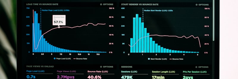
A good KPI is a number you can actually act on
A KPI, short for Key Performance Indicator, measures how close an organization is to its strategic goals. But here is the catch: not every metric is a KPI. To earn the label, a metric has to clear four bars:
- Strategic alignment: Must be directly related to high-level goals
- Actionability: Must allow for intervention based on the results
- Measurability: Must be measurable in a clear, repeatable way
- Timeliness: Must be reportable at the right time and frequency
A problem I run into constantly with firms across Turkey and the TRNC is that a flood of metrics quietly kills focus. I once watched a manufacturing firm track 147 different KPIs; in the board meeting, nobody could say which ones actually mattered most.
Industry-specific KPI requirements vary, but the underlying design principles stay the same.
Principles for Creating SMART KPIs

The SMART framework turns vague goals into concrete KPIs
The quickest way to turn a fuzzy goal into a measurable KPI is the SMART framework:
S – Specific
The KPI has to be clear about what it measures. Not “increase performance,” but “increase production quantity per unit.” Vague wording just leaves room for everyone to interpret it differently.
M – Measurable
It has to be expressed as a number or a ratio. Instead of “increase customer satisfaction,” set something concrete like “increase the NPS score from 45 to 55.”
A – Achievable
The goal can be a stretch, but it should not be impossible. Weigh past performance, industry averages, and the resources you actually have. Targets nobody can reach kill motivation faster than no target at all.
R – Relevant
It has to connect directly to a strategic goal. “Number of website visitors” says nothing on its own; it only earns its place next to “conversion rate” or “cost per lead.”
T – Time-bound
It has to say when it will be measured and by what date the goal is due. “Increase sales by 15% by the end of Q3,” not just “increase sales.”
SMART Transformation Example
Before: “Increase customer satisfaction”
SMART version: “Reduce average customer complaint resolution time from 48 hours to 24 hours to increase the NPS score from the current 42 to 52 by the end of Q3 2026”
Leading vs. Lagging Indicators

A balanced KPI set shows both where you came from and where you are headed
One of the trickiest balances in KPI design sits between leading and lagging indicators:
Lagging Indicators
These report the results of past performance. Easy to measure, but by the time you see them the window to intervene has mostly closed.
- Monthly/annual revenue
- Net profit margin
- Customer churn rate
- Production cost
- Employee turnover rate
Leading Indicators
These give you an early read on future performance. Plenty of room to intervene, but harder to measure.
- Sales pipeline value
- Quote-to-order conversion rate
- Customer satisfaction score (NPS/CSAT)
- Employee training hours
- Number of process non-conformities
Balanced Usage
A solid KPI set carries both. Managing on lagging indicators alone is like driving while looking only in the rearview mirror. Leaning entirely on leading indicators, on the other hand, makes it hard to confirm the results actually landed.
Golden ratio (observation): in practice, a set tends to settle when roughly 60% is lagging and 40% leading.
Balanced Scorecard Framework

The Balanced Scorecard balances strategy across four perspectives
The Balanced Scorecard (BSC), developed by Kaplan and Norton, looks at strategy through four perspectives at once. In KPI design, that is what keeps you from getting stuck on a single (usually financial) view.
1. Financial Perspective
“How do we look to our shareholders?”
- Revenue growth rate
- Gross/Net profit margin
- Return on Investment (ROI)
- Cash conversion cycle
2. Customer Perspective
“How do our customers see us?”
- Customer satisfaction (NPS/CSAT)
- Customer loyalty / repeat purchase rate
- Market share
- Customer Acquisition Cost (CAC)
3. Internal Process Perspective
“In which processes must we excel?”
- Overall Equipment Effectiveness (OEE)
- Lead time
- Error/waste rate
- Process accuracy
4. Learning and Growth Perspective
“How do we continue to improve and create value?”
- Employee training hours
- Employee satisfaction
- Innovation rate (revenue from new products)
- Information systems maturity
Connection Between Perspectives
The power of the BSC lies in the cause-and-effect chain between perspectives. For example: Employee training increases (learning) → Process quality improves (internal processes) → Customer satisfaction rises (customer) → Profit margin increases (financial).
Integrating KPIs with OKRs
OKR (Objectives and Key Results) is a goal-setting framework that firms like Google and Intel put on the map. KPIs and OKRs do different jobs, but side by side they reinforce each other.
Difference Between KPI and OKR
- KPI: Business-as-usual performance indicators that are monitored continuously
- OKR: Ambitious goals meant to be achieved within a specific period (usually a quarter)
Usage Together
KPIs show “health”; OKRs show “where we are going.” A speedometer on a dashboard is like a KPI, while the goal of “reaching Istanbul in 3 hours” is like an OKR.
Integration Example
KPI: Customer complaint resolution time (continuous monitoring, target: <24 hours)
OKR: “Transform customer support experience in Q2” (Objective) + “Reduce complaint resolution time from 48 hours to 12 hours” (Key Result)
Here the KPI keeps a pulse on daily operations, while the OKR drives the ambitious improvement.
15 Critical KPIs for the Management Dashboard
The 15 KPIs below are the ones most senior teams should be watching, whatever the sector. Adapt them to fit how your own company actually runs.
Financial KPIs (5)
- Monthly Recurring Revenue (MRR): Critical for subscription/recurring revenue models
- Gross Profit Margin: Indicator of pricing and cost efficiency
- Net Working Capital Conversion Cycle: Health of cash flow
- EBITDA: Operational profitability
- Revenue / Employee: Indicator of productivity and scalability
Customer KPIs (4)
- Net Promoter Score (NPS): Customer loyalty and referral tendency
- Customer Lifetime Value (CLV): Long-term customer profitability
- Customer Acquisition Cost (CAC): Growth efficiency
- Customer Churn Rate: Retention performance
Operational KPIs (4)
- Overall Equipment Effectiveness (OEE): Production efficiency (availability x performance x quality)
- Lead Time: Customer commitment performance
- First Time Right (FTR) Rate: Quality and rework cost
- Inventory Turnover Rate: Capital efficiency
Human Resources KPIs (2)
- Employee Engagement Score: Leading indicator of motivation and productivity
- Critical Position Fill Rate: Indicator of organizational risk
Dashboard Design Principles
A well-designed dashboard gives you the picture in seconds
You can design brilliant KPIs and still waste them on a bad dashboard. A handful of principles make the difference:
1. Visual Hierarchy
The most critical KPIs belong at the top and to the left, because the eye naturally starts from the top left. Whatever should register “at first glance” has to live in the upper section of the dashboard.
2. Contextual Presentation
A number on its own is meaningless. Every KPI should come with the context around it:
- Target value
- Comparison with the previous period
- Trend direction (increase/decrease)
- Status color (green/yellow/red)
3. Drill-Down Capability
Being able to move from a high-level metric down to the detail is critical. “Sales dropped by 8%” is not enough; you need to drill in by region, by product group, by customer segment.
Drill-Down Hierarchy Example
Total Revenue → By Region → By Product Group → By Customer → By Invoice
4. Action-Orientation
A dashboard should not just inform, it should trigger action. When a red indicator lights up, the answer to “what do I do now?” has to be clear. Alert thresholds and clear ownership are what make that happen.
5. Simplicity
Show a maximum of 12-15 KPIs on a dashboard. Anything past that turns into noise. Edward Tufte’s “data-ink ratio” principle holds here: every pixel should carry information, not decoration.
6. Real-Time Capability
Operational KPIs should be real-time where possible, or at least refreshed daily. A KPI you only update weekly or monthly pushes you into reacting rather than getting ahead of things.
Field Example: Production Firm KPI Transformation

Situation
A metal processing firm with 180 employees. 2 production facilities, 45 machines, 120+ customers. The starting point: Excel reports, a different set of metrics from each department, and a 3-hour report presentation at the monthly management meeting. Senior management’s complaint was blunt: they “couldn’t see the forest for the trees.”
KPI Design Process (representative duration: 6 weeks)
- Weeks 1-2: Strategy workshop – 3-year goals and critical success factors were determined
- Weeks 2-3: The existing 87 metrics were reviewed, and 62 were dropped (no strategic connection, not measurable, or redundant)
- Weeks 3-4: 15 senior management KPIs and 35 department KPIs were determined using the Balanced Scorecard framework
- Weeks 4-5: Data sources were defined and automated extraction processes were established
- Weeks 5-6: Dashboard design, drill-down structure, and alert thresholds were determined
Result (observed, after 6 months)
- Management meeting duration: From 3 hours to 45 minutes
- Decision-making speed: From an average of 2 weeks to 3 days
- Production efficiency via OEE tracking: +12 points
- Employee engagement: “I know my KPI” rate increased from 28% to 91%
7 Most Common Mistakes in KPI Design
1. Setting Non-Measurable Goals
Phrases like “being customer-oriented” or “improving quality” are not KPIs. Every goal has to be expressed as a number or a ratio. Otherwise you can’t define success or failure at all.
2. Tracking Too Many KPIs
A firm tracking 147 metrics is effectively tracking none of them. The overload drains focus and slides into “analysis paralysis.” For senior management, 12-15 KPIs is plenty.
3. Using Only Lagging Indicators
Result metrics like revenue, profit, and cost matter, but they arrive late. They report on something that has already happened. Without leading indicators, proactive management is off the table.
4. Failing to Connect KPIs with Strategy
The “everyone measures it, so let’s measure it too” approach. Why this metric? Which strategic goal does it serve? If there’s no answer, you’re tracking statistics, not KPIs.
5. Not Defining Target Values
Is “OEE: 72%” good or bad on its own? A KPI without a target is meaningless. Set the target off past performance, an industry benchmark, and the strategic intent behind it.
6. Not Defining KPI Ownership
The old principle: what everyone is responsible for, no one is responsible for. Each KPI needs a single owner, the person authorized and accountable for watching it, analyzing it, and acting to improve it.
7. Not Updating the Dashboard
Even the best-designed KPI set goes stale. Strategy shifts, market conditions move, new competitive dynamics show up. Review the KPI set at least once a year.

The wrong KPI feeds the wrong decision
KPI System Success Metrics
Use the following metrics to evaluate how well your KPI system is working (representative values):
| Metric | Baseline | Target | Measurement Method |
|---|---|---|---|
| KPI awareness rate | 30% | 90%+ | Employee survey: “Do you know your KPI?” |
| Dashboard usage frequency | Monthly | Daily | System access logs |
| Data update latency | 7+ days | <24 hours | Data timestamp check |
| Management meeting duration | 3+ hours | <1 hour | Meeting records |
| Decision-making speed | 2+ weeks | <3 days | Decision tracking system |
| KPI target achievement rate | 40% | 70-80% | End-of-period KPI evaluation |
| Action conversion rate | 20% | 80%+ | Time from red KPI to action |
These metrics show the “health” of your KPI system. Review them at least twice a year.
KPI Design Checklist
Check the following items when designing or reviewing your KPI system:
A. Strategic Alignment
- Company strategy and 3-5 year goals documented
- Critical success factors (CSF) determined
- Each KPI mapped to at least one strategic goal
- KPI hierarchy (company → department → individual) established
B. KPI Definition
- Each KPI meets SMART criteria
- Leading and lagging indicators balanced (40%-60%)
- Balanced Scorecard 4 perspectives represented
- Senior management KPI count between 12-15
- Single owner defined for each KPI
C. Data and System
- Data sources defined and accessible
- Data quality verified (missing, erroneous, inconsistent data check)
- Automated data extraction process established
- Update frequency and timing determined
D. Dashboard and Presentation
- Visual hierarchy created (important KPIs at the front)
- Target, trend, status color defined for each KPI
- Drill-down capability planned
- Mobile access provided
- Alert/notification thresholds determined
E. Governance and Continuity
- KPI review meeting calendar created
- Annual KPI set review process defined
- Employee training planned and implemented
- Success and improvement stories shared
This checklist can be expanded to fit your industry-specific needs.
Frequently Asked Questions (FAQ)
Get Support for Your Project
I can help guide your digital transformation initiative. Book a free preliminary call to discuss your priorities.